- AlternaStack
- Posts
- 📊 5 Tools That Transform Data Analysis From Complex to Compelling
📊 5 Tools That Transform Data Analysis From Complex to Compelling
Turn raw data into actionable insights without the technical overhead
Kareem Azees
February 04, 2025 • Estimated Reading Time: 2 minutes
Hey there and welcome to another edition of Five Tool Tuesday!
The evolution of data analysis tools has reached a critical inflection point. As organizations grapple with increasing data complexity, the need for intuitive, powerful analysis tools has never been more pressing. This week, I'm examining five transformative tools that are reshaping how teams extract value from their data assets.
Let's analyze how these tools are democratizing data insights while maintaining enterprise-grade capabilities.
1. 🎯 Basedash: Revolutionizing Business Intelligence Through Natural Language

Basedash is an AI-native BI tool that generates dashboards and charts using natural language queries. Connect it to your database, and it auto-suggests visualizations while enabling SQL editing and team-based permissions.
Why we love it: Democratizes data analysis by letting stakeholders ask questions in plain English.
2. 🔐 AskCSV: Secure, Local Data Analysis at Scale
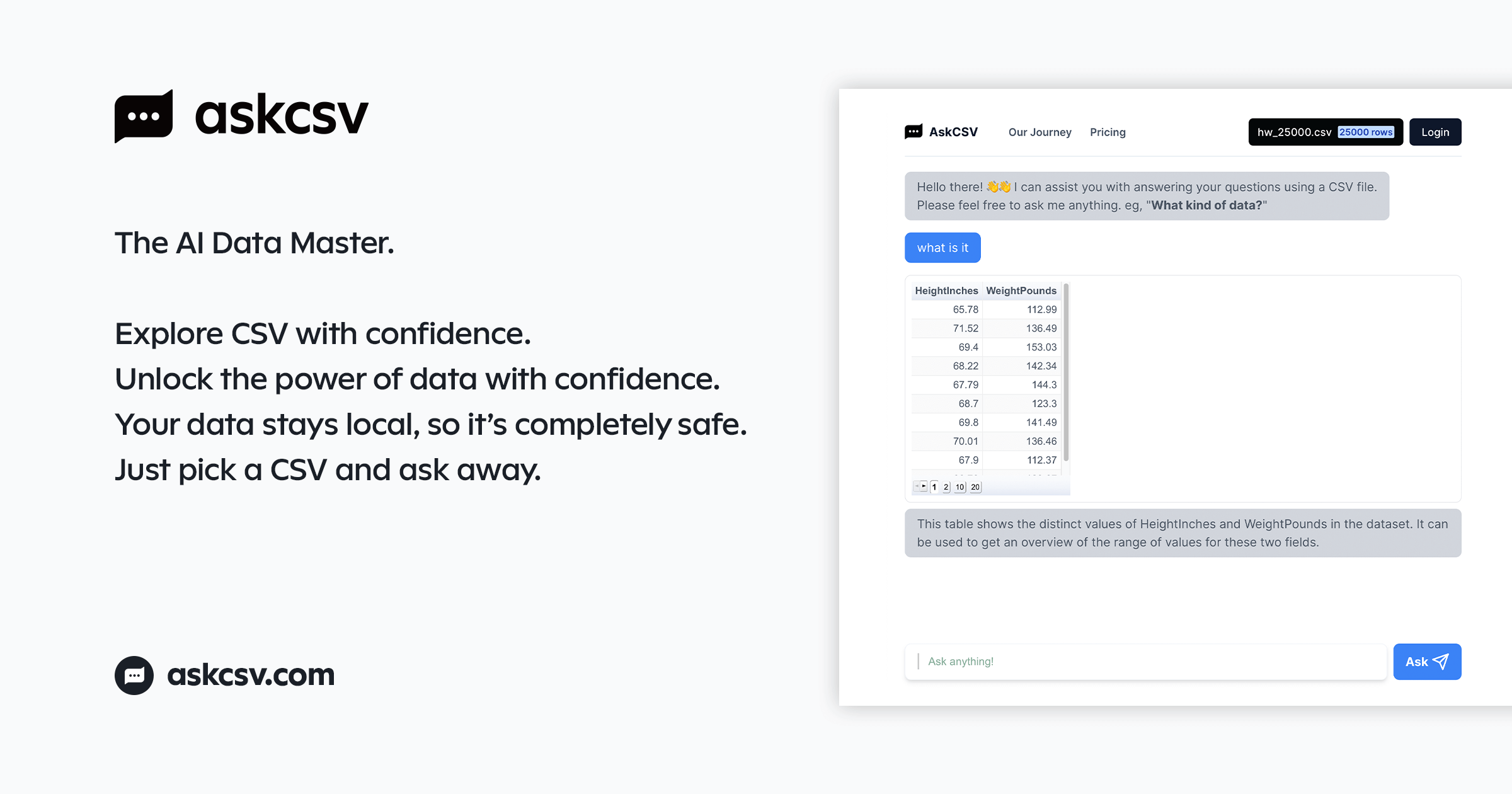
Analyze CSV files locally using AI—no data leaves your device. AskCSV answers questions, generates summaries, and identifies trends without compromising sensitive information.
Why we love it: Prioritizes data privacy while delivering GPT-4-level insights offline.
3. ⚡ PowerDrill.ai: Enterprise-Scale Analysis with AI Acceleration

PowerDrill.ai is an AI assistant for heavy-duty data tasks, from cleaning datasets to automating reports. It integrates with tools like Snowflake and BigQuery, offering code snippets and one-click visualization exports.
Why we love it: Cuts repetitive work by 10x, freeing analysts to focus on high-impact decisions. These tools bridge the gap between data complexity and user-friendly design, whether you’re visualizing trends, securing sensitive datasets, or automating workflows. Pair them to build a seamless pipeline from analysis to presentation.
4. 📈 Graphy.app: Collaborative Data Storytelling Platform

Create interactive, publication-quality graphs for data storytelling. Graphy’s intuitive interface lets users design dynamic charts with animations, annotations, and embedded formulas, all shareable via links or embeds.
Why we love it: Balances aesthetic appeal with analytical depth—perfect for teams needing to present data persuasively.
5. 🎨 Napkin.ai: Visual AI for Strategic Communication
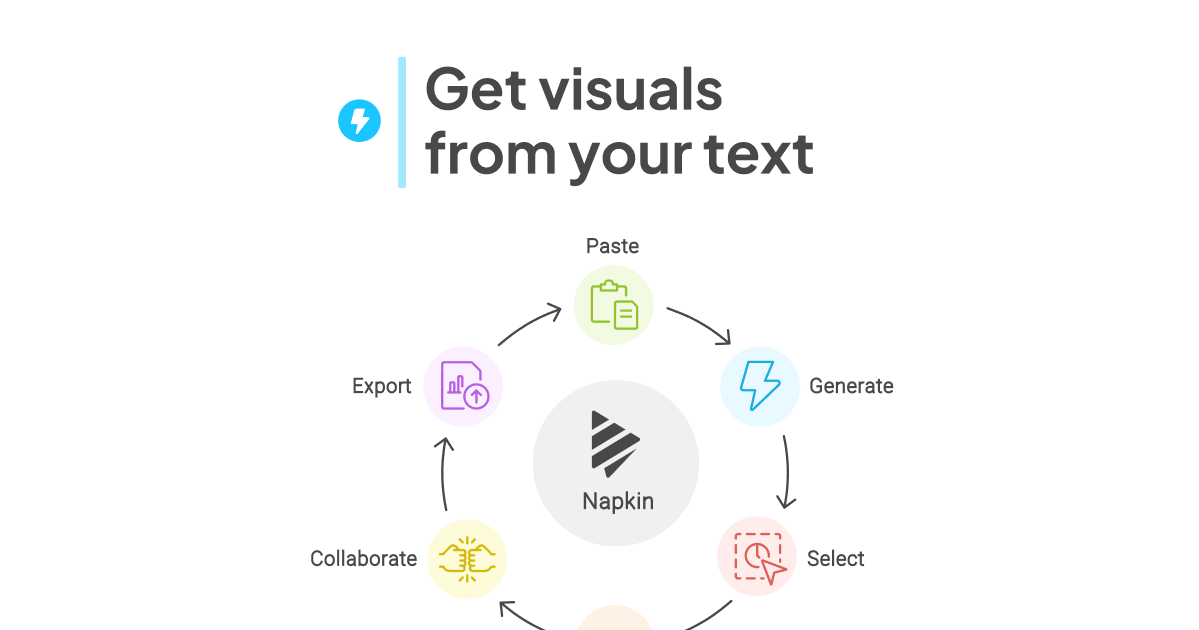
Napkin.ai represents the convergence of AI capabilities with design thinking principles.
A visual AI platform that converts text into editable infographics, flowcharts, and diagrams. Ideal for crafting polished visuals for presentations, blogs, or social media, Napkin.ai supports exports in multiple formats (PNG, SVG, PDF) and offers real-time collaboration.
Why we love it: Simplifies complex storytelling with drag-and-drop customization, making it accessible even for non-designers.
👋 Your Turn
How is your organization approaching the integration of AI-powered data analysis tools? What challenges have you encountered in balancing accessibility with analytical depth?
Reply to this email and share your implementation insights.
Did someone forward you this scroll of wisdom? Subscribe to AlternaStack for new tools weekly!